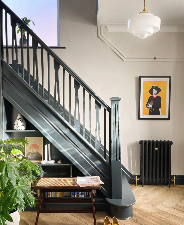
3 Colour Palettes to Go With Your Brass Obsession
If you've been around the shop or seen us on Instagram, you may have noticed our (not so) healthy obsession with brass. It's warmth, texture and radiance make it an incredibly versatile accent material. Fall in love and get inspired with these beautiful colour pallets from Studio David Thulstrup (because we're totally obsessed with their work and had to come up with an excuse to feature it.)

Forest Green, Soft Purple and Brass
I love this classic yet bold colour combination. The soft pink and grey tones are strengthened by the strong jade greens coming through. This is a great one also to inspire mixed textured from the newly renewed Terrazzo surfaces to grainy wood surfaces.
The green tones could be further enhanced in the space by introducing plants, such as the ZZ plant, Snake plant and a Stag-horn Fern, all strong leaf shapes to stand out amongst such strong colours

Green marble, rich reds and soft accents
Moving to a slightly warmer mood board, this contains some beautifully rich colours. The green marble and wine burgundy velvet side by side work really well, and again work great with the warm brass colour. The pops of other colours coming through, such as yellow pink and muted orange means you can use an eclectic palette of colours and textures.Your home should represent you and contain an eclectic mix of pieces gathered over time. So rather than rushing out and buying on trend pieces, look around at what you have and review where they should go. I'm often moving pieces around, especially soft furnishings and plants!

Researching moodboards is one of our ‘go to’ & really important steps for interior design. When we work with customers to choose our customisable lighting, we always suggest these types of moodboards. Most of our pendant lights are available with various metal finishes and fabric cable finishes. Not to mention our different shade designs.
Take a look at our Reeded Glass Pendant and try some different colour combinations to find one that suits your mood board.

Soft Blues, bright whites with touches of Brass
Now for something a little fresher. If the broody dark interiors that are doing the rounds currently aren't grabbing you, then this brighter fresher palette may be just your cup of tea. The cool whites and baby blues work beautifully with either a grey marble or terrazzo surface. Brass as an accent metal will also blend gorgeously with this fresh theme, which I think would work really well as a kitchen colour scheme.
If you were to go with blocks of bright blue or white for kitchen cupboards, you can easily play with surface pattern and texture on the counter tops. Terrazzo is the use of stone and marble off cuts set into cement, so is an eco choice of materials. You can get it poured in situ, get it cut to size or buy ready to go tiles. Below are some sample images from an English producer of Terrazzo, Diespeker & Co. The possibilities are endless with this process where you get to custom design the exact colour palette you want for your floor/ counter top/ Table/